It's a live deck. Press start, then scroll or use the arrow keys, or play it full screen.
Play the 2026 deckHans Rosling's data story, slide by slide
-
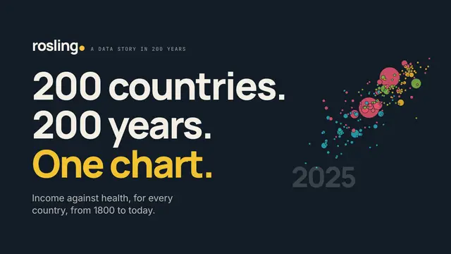 01200 countries. 200 years. One chart.
 -
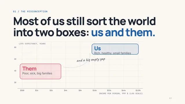 02Most of us still sort the world into two boxes: us and them.
 -
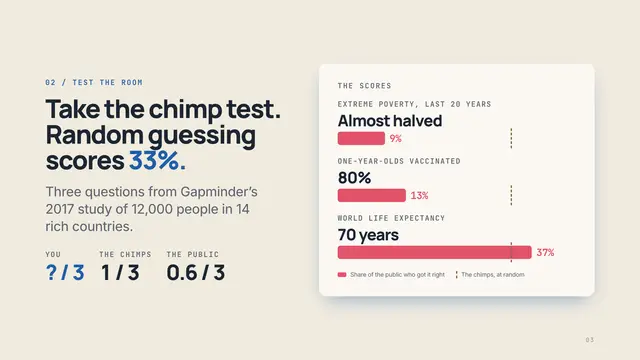 03Take the chimp test. Random guessing scores 33%.
 -
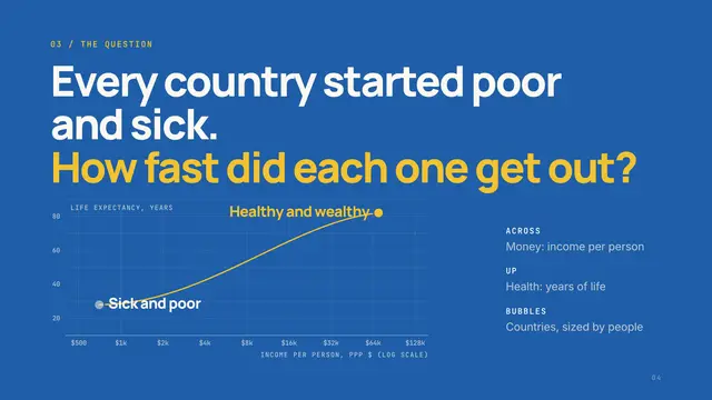 04Every country started poor and sick. How fast did each one get out?
 -
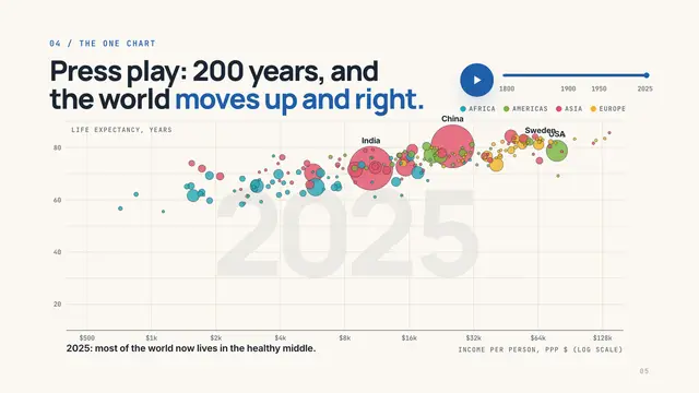 05Press play: 200 years, and the world moves up and right.
 -
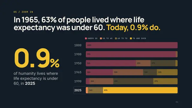 06In 1965, 63% of people lived where life expectancy was under 60. Today, 0.9% do.
 -
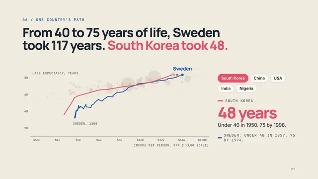 07From 40 to 75 years of life, Sweden took 117 years. South Korea took 48.
 -
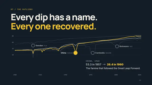 08Every dip has a name. Every one recovered.
 -
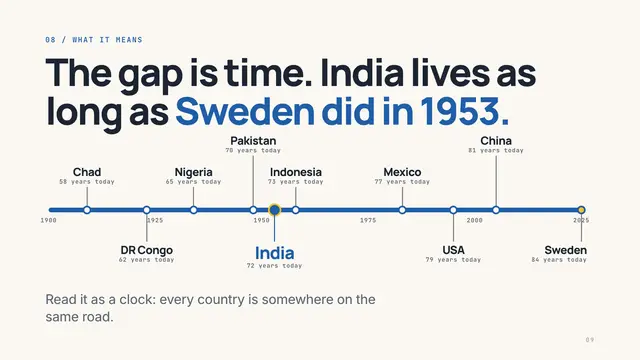 09The gap is time. India lives as long as Sweden did in 1953.
 -
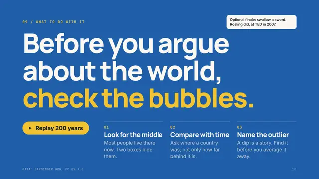 10Before you argue about the world, check the bubbles.
Then · 2010
How it really went
Read the real storythe talk, via Wikipedia (The Joy of Stats, BBC Four, 2010; data from Gapminder) ↗- Rosling stands beside a huge, empty chart: income across, life expectancy up
- He starts in 1810: every country is poor and sick, bottom left
- The industrial revolution lifts Europe and its offshoots first
- World War I and the Spanish flu knock the world back down
- After the war, independence and health care pull Asia, Africa and Latin America up
- By the present, most countries sit in the middle, not in two groups
- He splits China: Shanghai is like Italy, inland Guizhou like Pakistan
- He closes on the gap: everyone can make it to the healthy, wealthy corner
Now · 2026 · 10 slides
What we changed
- You take the chimp testThree questions in the spirit of Factfulness, scored live against the 2017 public (9%, 13%, 37% right) and against chimps guessing at random (33%).
- The chart actually plays184 countries from 1800 to 2025 on Gapminder's open data, with a play button, a year scrubber, live captions, and a number for every bubble you hover.
- Sweden is the clockSweden's whole road on the chart, with South Korea, China, the USA, India or Nigeria laid beside it, then every country pinned to the year Sweden lived as long.
- The dips get namesClick the outliers: the 1918 flu, China's famine, the Khmer Rouge, HIV in Botswana. Every one recovered.
Steal the structure
Build your data story like Hans Rosling did.
- 01 Cover Name the dataset and the promise: what the one chart will show.
- 02 Misconception Draw the picture the audience already holds, so the data has something to overwrite.
- 03 Test the room Three quick questions that prove the misconception, scored against chance.
- 04 The question Explain the axes and ask the one question the chart answers.
- 05 The one chart Play the data over time; let people scrub, pause and hover.
- 06 Zoom in Stop the clock on the surprise and put one number on it.
- 07 One path Follow a single case the audience knows, against one they don't.
- 08 Outliers Name the exceptions and what explains them, instead of averaging them away.
- 09 What it means Turn the chart into one sentence the audience can repeat.
- 10 What to do Three habits to take home, and a way to replay the chart.
Make yours in ChatGPT
Type your site. We'll write the prompt with Hans Rosling's structure and your brand.